The challenge
The existing data was not looking good. We saw a decent number of signups for the cloud-based platform, but there was a steep decline in active usage after only a few days. In fact, 92% of users were dropping off within the first week of use. Some of this is expected for a freemium product, but we had to do better.
Clearly, we had an engagement problem. Our hypothesis was that users did not understand the full value of the platform and the product was not doing a great job of educating them during the onboarding experience. Users were landing in the product without enough guidance and weren’t being ushered along in the journey. In addition, they weren’t bringing their coworkers into their new workspace while trialling the product and therefore could not experience the true value of a collaboration platform.
A week-long design sprint
This was a cross-functional effort that required a number of focused workshops across many different teams. Credit to Anneliese Klein for facilitating these workshops. The two of us collaborated on the design solutions and explorations throughout the sprint and it was a team effort to get to a point where we had solid solutions that could make a real impact on time-to-value.
“How might we” - problem definition and opportunity statement
Competitive analysis screenshots
Sample of crazy 8s sketches and solution sketching
Exploration and Iteration
After going through an intense week of research, competitive analysis and solution sketching, we then explored ideas in higher fidelity and conducted some user tests on top solutions.
Final Solutions
Ultimately we landed on a wizard-like, guided flow with focused screens that had only one question per screen. This kept the user engaged while keeping the cognitive load low at each step to ensure we didn’t lose or overwhelm them.
Email verification step improvements.
We instituted the use of a verification code rather than a click-through link from the email as that caused a confusing flow for users opening new tabs and creating a broken experience adding to drop-off.
Guided selections to personalize the experience and communicate value
We wanted to offer the most relevant guidance along the way, so we added steps to make selections for their desired use case. This also ended up being a good opportunity to educate on some of the value the platform offered.
Selecting tools to connect up-front
One of the most valuable parts of a collaboration platform is the ability to connect external tools in your toolchain and monitor or interact with those tools while remaining in your collaboration platform.
We found a very positive correlation between active usage and connected tools in the workspace.
Guiding the creation of the first channel
Through our research and competitive analysis, we found that if users were engaged in the actual creation and setup of content in their workspace from the get-go, they were more likely to understand the value of the tool and engage in it. It would also add a sense of personalization without dropping them in to a complete empty state.
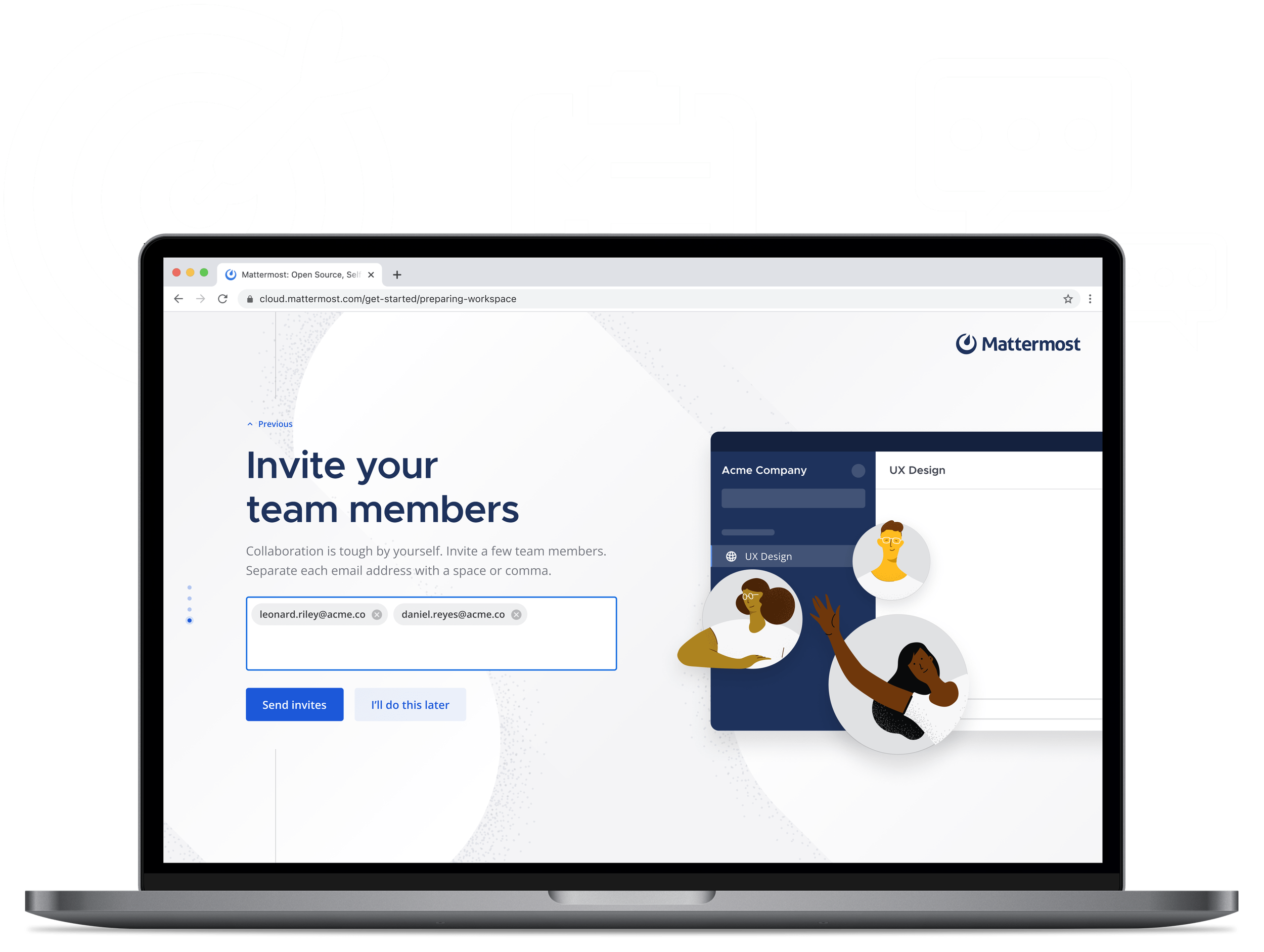
Inviting users from the start
In a collaboration platform, users can’t truly benefit from using it when they are alone. To make it easier, we added a step to invite coworkers during the initial setup.
Welcome video and onboarding checklist
Once users complete the initial workspace creation flow, they land in their new workspace with the channel they created. A product tour welcome video and checklist of onboarding tasks displays to help familiarize themselves with their new workspace.
The checklist is personalized based on their selections from the initial onboarding. We chose the checklist method for onboarding because it gave users the option to decide the type of guidance they wanted. In previous versions of the onboarding process, we received feedback from our users that being automatically shown guided tours annoyed and frustrated many of them who wanted to explore on their own. The task list allowed us to provide guidance to those who needed it and let others skip the guidance altogether.
Prototype walkthrough
In the end, we ended up with a much more polished experience that started users in a much more helpful beginning point that more readily demonstrated the value of the platform.
One of the specific metrics we discovered was most impacted by this was the number of installed integrations in new workspaces. More integrations meant more engagement. Because we made this a part of the onboarding experience, users were able to see how Mattermost can be leveraged as a communication ‘hub’ rather than just a chat tool.
As we continued to analyze the success of the onboarding improvements, we learned which of the steps in the flow ended up having the greatest impact on engagement and continually iterated as we gathered more data.